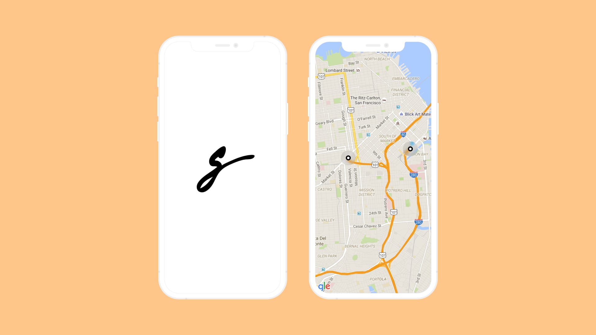
Spot Swap

In 2017, as part of a college UI/UX project, I created Spot Swap, a mobile app designed to help university and college students find parking on campus. By leveraging IoT devices, the app provides real-time parking availability on an interactive map, making the process faster and less stressful.
The challenge
The idea for Spot Swap came from my own daily struggle to find parking on campus. I quickly realized that I wasn’t alone, and many of my peers faced the same frustration. To validate this, I gathered insights from classmates, professors, and even visited nearby universities to observe parking patterns at different times of day.
Through this research, I uncovered several key issues:
- Many students relied on cars, leading to overcrowded parking lots and high parking costs (e.g., monthly/annual permits).
- Universities often issued more parking permits than spaces available, intensifying competition for spots.
- Traffic flow varied greatly depending on class schedules, making parking availability unpredictable.
- Rising enrollment only exacerbated parking scarcity, and expanding parking facilities was often cost-prohibitive for institutions.
All of this highlighted just how challenging parking had become for students and how Spot Swap could make a difference. By integrating real-time parking availability with existing permit systems, the app could ease frustrations for students while providing universities with a scalable, efficient solution.
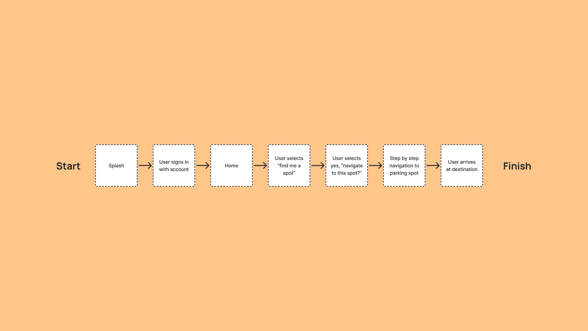
Shaping the flow
The goal was to design a simple and efficient user flow, allowing users to find a parking spot with as few steps as possible. By minimizing unnecessary screens and features, the app ensures a distraction-free experience that keeps users focused on the task at hand.
After all, the primary objective of Spot Swap is to help students quickly locate and navigate to available parking spots on campus, requiring no more than a few simple interactions to get the job done.
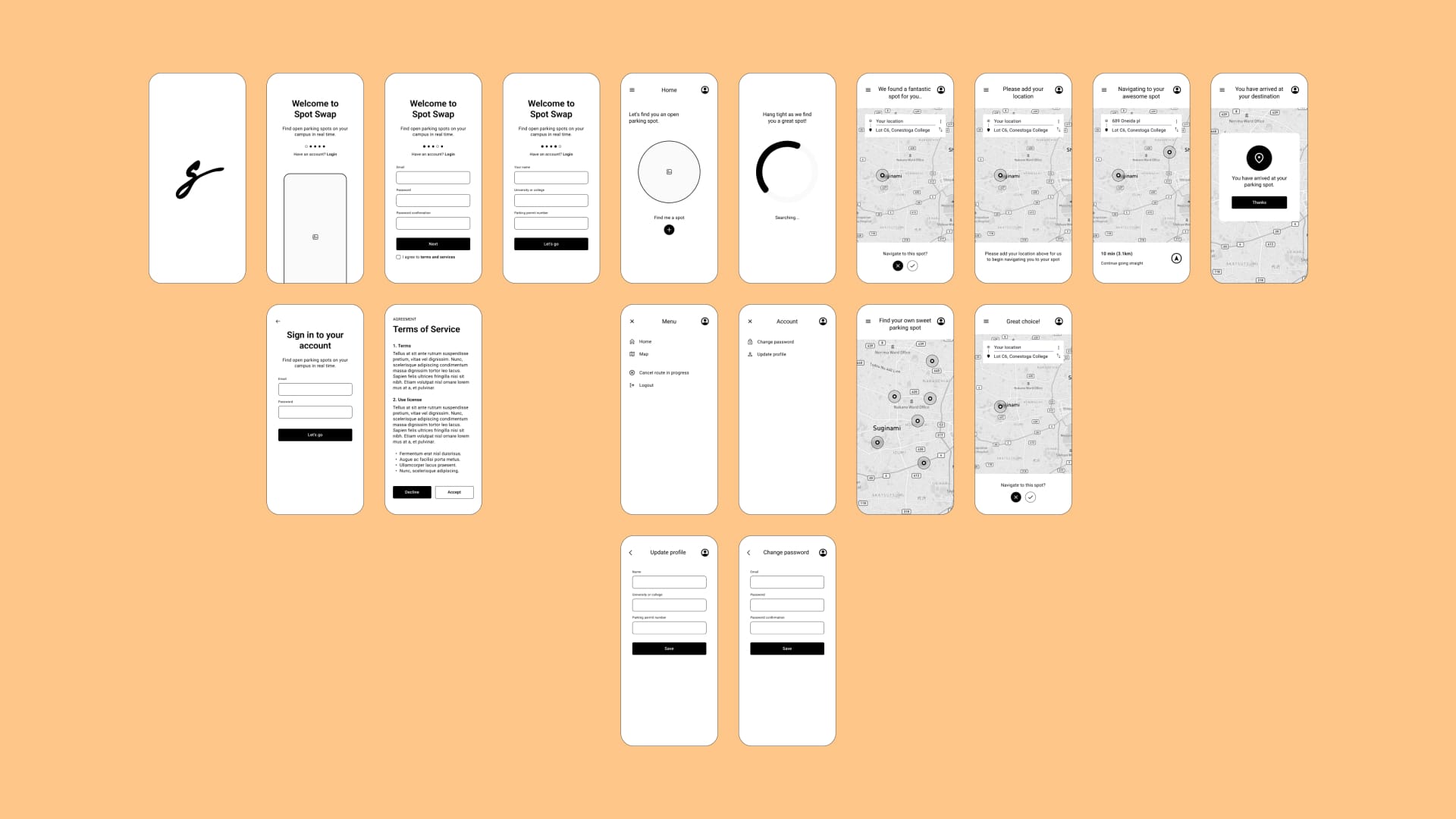
Lo-fi wireframe development
In this phase, I took the user flow to the next level by designing the basic layout of the app. Using a monochromatic, low-fidelity wireframe, I incorporated all necessary UI elements on each screen. The focus was on maintaining a clean, simple design that eliminates distractions, ensuring users stay focused on the core purpose of the app. This minimalist approach also serves as the foundation for the next stage, where I’ll introduce a more refined colour scheme and visual design.
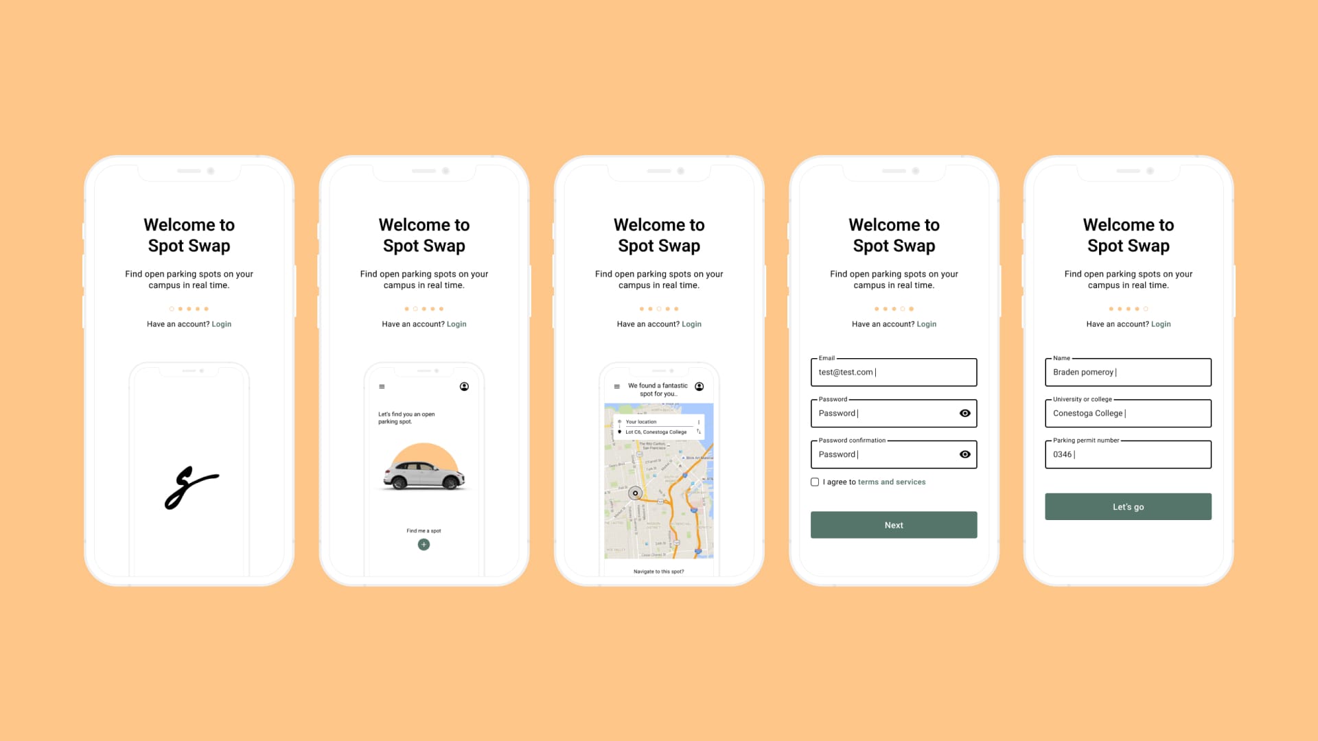
Visual design
At this stage, my focus shifted to bringing the wireframes to life with a stronger visual identity. I introduced colours, imagery, and replaced placeholder text with actual content to give the app a more polished look.
For the colour scheme, I opted for a modern blend of orange and green, creating a fresh and vibrant feel, something far from the traditional, dated look often associated with university apps. This bold choice was intentional; I wanted Spot Swap to stand out.
Additionally, I created a clean and simple logo/icon early on in the process to establish a cohesive visual identity before diving into the detailed design of the screens.
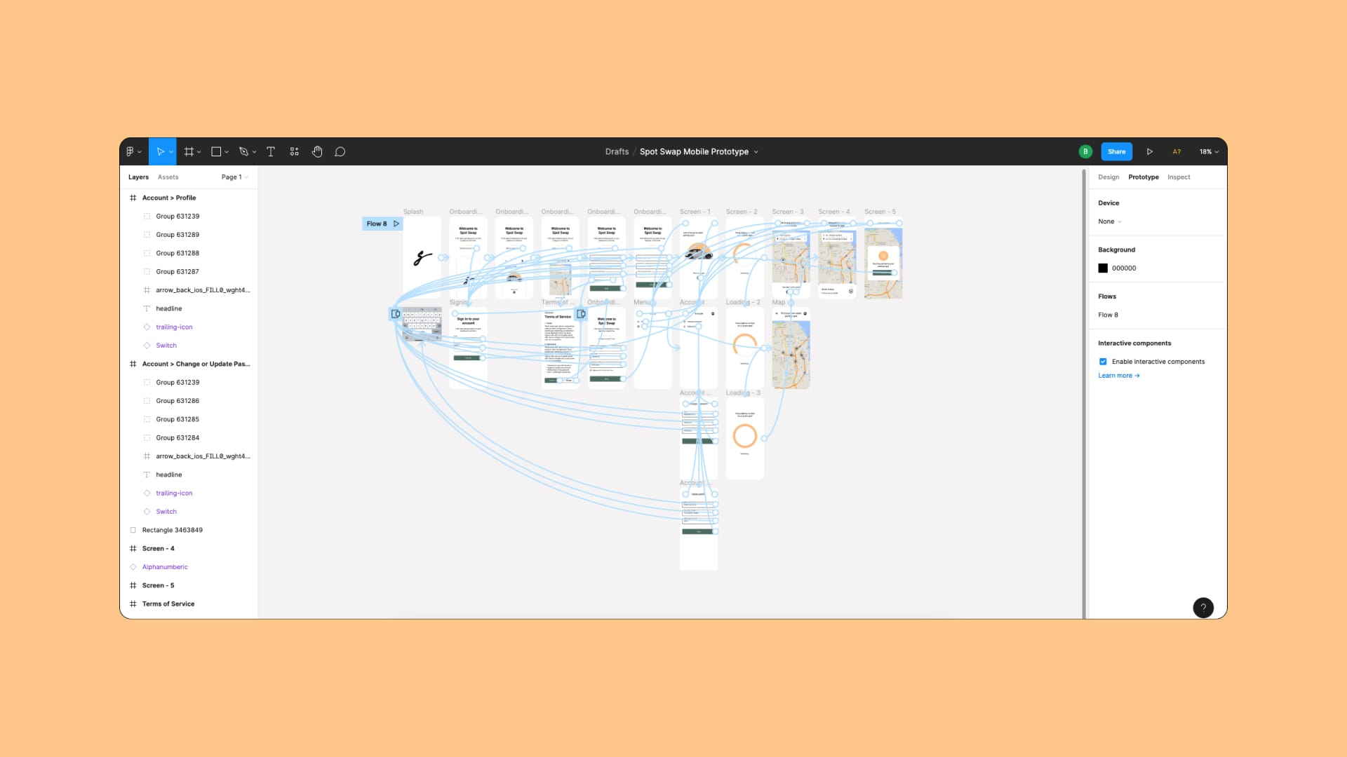
Prototyping
Finally, I organized all the components according to the plan to create the interactive prototype. This represents an early version of the final app, complete with all intended interactivity. I used Figma to bring everything together, making it easy to showcase each stage of the design process and demonstrate how the app would function in action. Check it out here!